Project Case Study · Sales & Marketing Reporting

GTC Weekly & Monthly Performance Reporting System

A Power BI dashboard connecting 5 data sources, paired with a purpose-built meeting workflow tool — designed so leadership walks into every weekly and monthly meeting with real numbers, not guesswork.

Organisation

The GTC Group

Data Sources Connected

Dynamics 365, GA4, Metricool, Mailchimp, NST

Deliverables

Power BI Dashboard · Meeting Workflow Tool

Cadence

Weekly & Monthly Leadership Meetings

Scroll
Services Demonstrated
Dashboard Development CRM Data Management Data Analysis & Insight Storytelling with Data

01 — The Brief

Problem & Approach

GTC's sales and marketing data lived across five disconnected platforms — Dynamics 365 for pipeline and leads, Google Analytics 4 and Metricool for digital performance, Mailchimp for email engagement, and Nigeria Seminars and Training (NST) for third-party course listings. Before this project, answering a simple question like "what's our pipeline coverage this week?" meant manually pulling numbers from several systems.

Leadership needed a single, reliable view they could walk into weekly and monthly meetings with — one that showed pipeline health, lead generation, marketing performance and risk areas without anyone needing to dig through raw CRM records first.

I designed and built a Power BI dashboard connecting all five sources, with custom DAX measures for things like pipeline coverage, deals at risk, and multi-currency revenue tracking — since GTC's courses are quoted and paid for in GBP, USD and NGN depending on the client.

I then went a step further: I designed a structured weekly and monthly meeting workflow — Performance Snapshot, This Week's Focus, Team Commitments, and Frictions/Blockers — and partnered with Lovable to build it as a web tool, so the dashboard's numbers feed directly into how the meeting is actually run.

Power BI DAX Dynamics 365 Google Analytics 4 Metricool Mailchimp Excel / Power Query Multi-Currency Reporting Lovable (AI App Builder)

02 — Data Sources

Five Platforms, One View

Dynamics 365

Pipeline, opportunities, leads, sales activity

Google Analytics 4

Website traffic & engagement

Metricool

Social media performance across platforms

Mailchimp

Email campaign engagement

NST

Third-party course listing leads

Marketing data without a native API connection was consolidated manually into a structured Excel tracker on OneDrive, then connected into Power BI via Power Query — keeping a single source of truth even where automated integration wasn't available.

Power BI — Sales & Marketing Reports

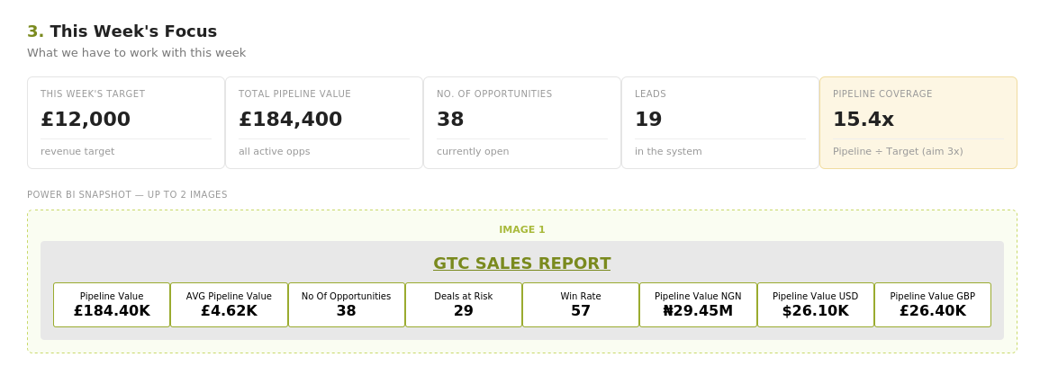
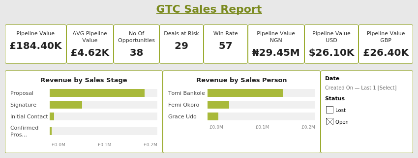
The Sales Report page tracks pipeline value, average pipeline value, open opportunity count, deals at risk, win rate and pipeline value broken out across GBP, USD and NGN — since GTC's courses are quoted and invoiced in whichever currency the client is based in. Revenue is also visualised by sales stage and by sales person, with date and status slicers for filtering live during meetings.

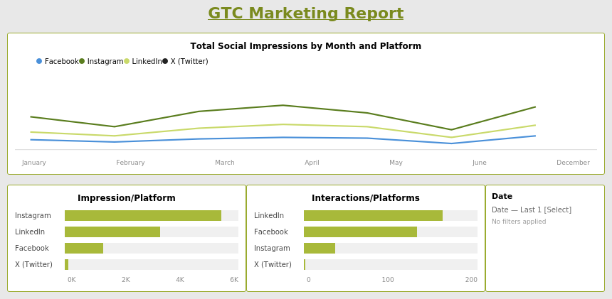
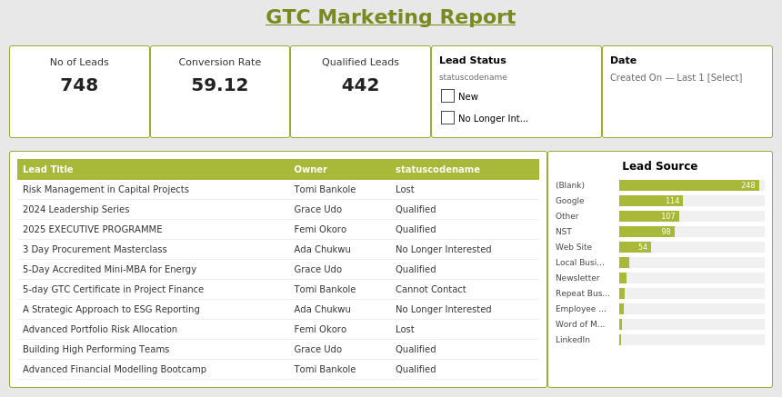
The Marketing Report pages track lead volume, conversion rate, and qualified lead count, with a searchable leads table and a lead source breakdown showing exactly which channel — Google, NST, LinkedIn, website, referral — is generating the most qualified interest. A second marketing page tracks social impressions and interactions by platform and month across Facebook, Instagram, LinkedIn and X.
DAX Measure
Deals No Activity 7+ Days = CALCULATE( COUNTROWS(opportunity), opportunity[statecodename] = "Open", opportunity[Modified On] <= TODAY() - 7 )
This measure flags any open opportunity that hasn't been touched — no calls, notes, or updates logged — in the last 7 days. Deals at Risk turns a CRM full of records into a single, actionable number leadership can act on in the meeting itself: which deals need attention right now before they go cold.

What the Dashboard Actually Solves

Insight 01

Multi-currency revenue, one true picture

GTC's courses are quoted and paid for in GBP, USD and NGN depending on the client. The dashboard shows pipeline value broken out by all three currencies side by side, so leadership sees real revenue exposure rather than a figure that hides currency risk.

Insight 02

Deals at risk, surfaced automatically

Rather than someone manually checking last-activity dates across dozens of open opportunities, the dashboard flags exactly which deals have gone quiet for 7+ days — turning a reactive check into a proactive one the team can act on weekly.

Insight 03

Lead source visibility drives spend decisions

The lead source breakdown shows precisely which channel — Google, NST, LinkedIn, referral — is converting. This took marketing spend decisions from a guess to an evidence-based call, since underperforming channels are now visible rather than hidden in aggregate numbers.

From Dashboard to Decision: The Weekly Workflow

A dashboard on its own doesn't run a meeting. So I designed a structured weekly and monthly review workflow — the concept and structure were mine, built as a working web app in partnership with Lovable — that walks the leadership team through exactly the same four stages every single week, with live Power BI snapshots embedded directly into the page.

01

Performance Snapshot

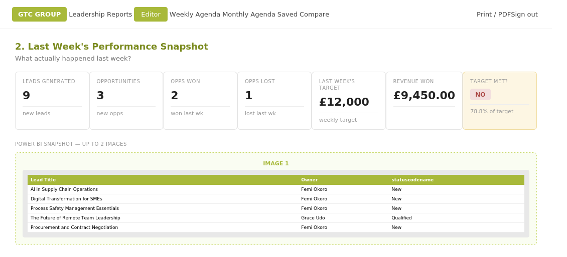
What actually happened last week — leads generated, opportunities won/lost, revenue against target, with the live dashboard screenshot pasted in for context.

5 mins
02

This Week's Focus

What we have to work with this week — current pipeline value, open opportunity count, and pipeline coverage against target, again grounded in a live dashboard snapshot.

5 mins
03

Commitments

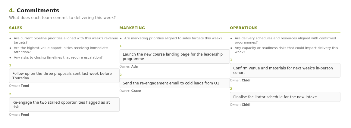
Sales, Marketing and Operations each commit to specific actions for the week ahead, with a named owner against every commitment — so accountability is visible, not implied.

10 mins
04

Frictions / Blockers

Issues actively blocking revenue or execution are logged live — who it affects and what needs to happen — so nothing gets raised once and forgotten.

10 mins
Weekly meeting tool showing Last Week's Performance Snapshot with leads generated, opportunities won and lost, and embedded Power BI screenshot
Performance Snapshot — with embedded live Power BI image 01 / 03
Weekly meeting tool showing This Week's Focus with pipeline value, open opportunities and pipeline coverage
This Week's Focus — pipeline coverage against target 02 / 03
Weekly meeting tool showing Commitments section with Sales, Marketing and Operations columns and named owners
Commitments — accountability by team and owner 03 / 03
My role: I designed the structure, flow and content of this tool myself — what questions each section should answer, how the four stages should sequence, and how Power BI snapshots should slot directly into the page rather than living in a separate file. Lovable was the build partner that turned that design into a working web app. The same structure runs both the weekly meeting and the monthly leadership review, with each team recording their own performance and adding live comments and observations directly into the tool during the meeting.

Spotlight — The Access Gap That Proved the Tool's Value

When the dashboard lived on one laptop

When I went on annual leave, that week's meeting went ahead without the dashboard — at the time, GTC didn't have Power BI Service, so the dashboard lived locally on my machine rather than somewhere the team could access independently. Without it, the team fell back on manually reviewing records in Dynamics 365 during the meeting itself, which meant losing the structured, at-a-glance view the dashboard normally provided.

It surfaced a real gap: a reporting tool is only as valuable as its accessibility. My manager's response was clear — make sure reporting materials are always shared and available on the cloud, not dependent on one person being present.

Outcome: shared access and cloud-based availability are now standard practice for every reporting tool I build — including the weekly meeting tool itself, accessible to the whole leadership team independently of any one person.

From One Dashboard to a Standard

1

Reporting access is no longer single-person dependent

Following the access gap during my leave, all reporting tools are now shared and cloud-accessible by default, so leadership reviews can happen whether or not I'm in the room.

2

A repeatable weekly and monthly rhythm

The same four-stage structure — Snapshot, Focus, Commitments, Frictions — now runs every week and every month, giving leadership a consistent format rather than a fresh agenda each time.

3

Named accountability replaced vague ownership

Every commitment in the meeting now has a named owner attached to it directly in the tool, making follow-up at the next meeting straightforward rather than a memory exercise.

4

Marketing channel spend is now evidence-led

With lead source visibility built into the dashboard, conversations about where to invest marketing budget now start from real channel performance data rather than instinct.